The Story Behind the Logo: Chanel, Rolex, Hermes and Longines

Here are the stories behind the famous and iconic logos of the luxury powerhouses in fashion, jewelry and watchmaking: Chanel, Hermès, Rolex, and Longines.
1. Chanel
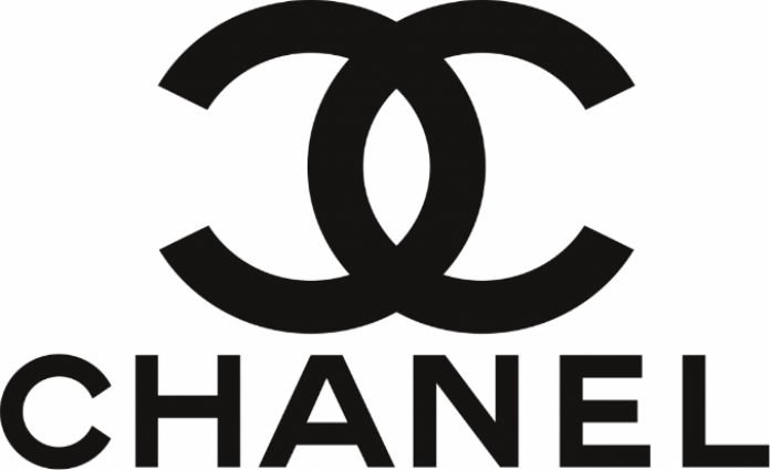
Chanel’s logo is arguably the most recognized logo in the world. The striking, opposite-facing and interlocking C’s is a striking and bold design, created by the brand’s namesake and founder, Coco Chanel, in 1925.
The story behind the logo’s inspiration is somewhat mysterious. Some believe the logo was a modification of the C-patterns used by the French Queen Claude and her daughter-in-law Catherine de Medici after share married into the family. Others assert the logo is an homage to Coco’s lover and business partner Arthur “Boy” Capel—after all, Capel’s own wardrobe served as the primary inspiration for Coco’s collections; why not be the inspiration for the logo too?
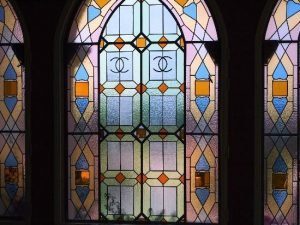
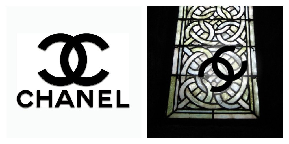
The Château de Crémat in Nice is another possible inspiration source. Coco’s friend, socialite Irene Bretz owned the estate and frequently invited Coco to visit. Legend supposes Bretz gave Coco permission to use the interlocking C’s that were the symbol for the vineyard and decorated property’s the doorways and windows as the logo for Coco’s then modestly small new company. Similarly, a final theory credits a stained-glass window in the Aubazine Chapel in central France (image above) where Coco spent a portion of her childhood living in their orphanage as the inspiration. The window featured interlaced curves which could have been abstracted into interlocking Cs.
2. Hermès

Hermès was founded in 1837 but its iconic logo was not introduced until the early 1950s. The luxury French manufacturer originally produced harnesses and bridles for the carriages of noblemen. Over the decades, the brand expanded its offerings to include leather goods and handbags, then scarves and ties.
The logo features a Duc carriage with a horse which harkens back to the brand’s original core offerings. It is believed the designers turned to the French painter Alfred de Dreux (1810-1860) and his painting “Le Duc Attele, Groom a L’Attente” (“Hitched Carriage, Waiting Groom”) as their primary inspiration source.
As for that distinct “Hermès Orange” hue, that was introduced after World War II. Due to supply shortages, Hermès had to drop their original packaging (cream colored boxes with brown edging) for orange ones. Hermès even won a packaging Oscar in 1994 for their unique boxes.
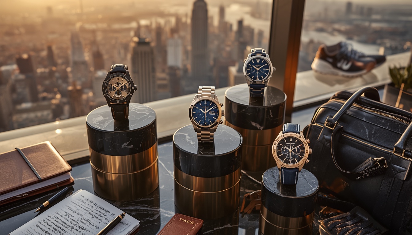
3. Rolex
The name Rolex itself has an unknown back story. Some historians believe it was borrowed from the French phrase “houloguorie exquise” which translates to “exquisite watchmaking.” Another common theory is that Rolex is derived from the sound of a winding watch. Others assert founders Hans Wilsdorf and Alfred Davis liked the crisp sound of Rolex, which was simple to spell and easy to pronounce regardless of your native language.
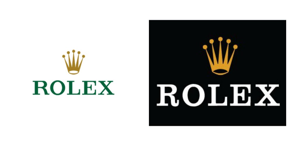
Wilsdorf and Davis trademarked the Rolex logo in 1925. The original design was a five-pointed coronet or crown in gold above Rolex in green text with a gold outline. The logo embodied the Rolex slogan, “A Crown for Every Achievement” and the chosen colors were meant to symbolize the brand’s excellence in watchmaking (gold) and prosperity (green).
The Rolex logo underwent two major updates in the brand’s history. In 1965, the crown was changed from gold to bronze and the text to a pewter blue. However, in 2002, Rolex reverted back to its original color scheme: a gold crown and a green font.
4. Longines
![]()
The Longines logo was used by the watchmaker starting in 1867, but it wasn’t formally registered and trademarked until 1889. Even with this lapse in time, the Longines logo is the oldest trademark of its kind, still active in its original form, according to the World Intellectual Property Organisation (WIPO).
Founder Ernest Francillon lifted the name Longines from the name of the site for his new factory in Switzerland. For his factory mark, Francillon chose a winged hourglass within a double circle. The stamp was originally intended to authenticate Longines’ watches and deter counterfeiters. In turn, the logo became a symbol of the brand’s manufacturing and design excellence and its rich history as a prominent Swiss watchmaker.
The Longines logo design has undergone a handful of modifications. The most recent update in 1981 was actually created in the same vein as the 1942-era logo.


1 Comment
[…] The Loupe 2015, The Story Behind the Logo: Chanel, Rolex Hermes and Longines, Accessed 5 May 2018 <https://www.truefacet.com/guide/story-behind-logo/;. […]